IPIPELINE


Diagnosed experience flaws in a wealth management based SaaS product


iPipeline, a SaaS company, provide digital systems to speed up and maximise efficiencies in the life insurance and wealth management lifecycle.
The Problem
The website is currently an information repository of content. Users generally need more than five clicks to get to important information and, once there, the interaction and asset options are very limited. Also They want to transition the current site away from an FYI-data dumping ground and focus on generating more leads and Improve the overall Structure of the website so that I-pipeline can improve its website from a UX point of view to improve to meet the business goal i.e Optimize conversion and product discoverability metric.

Our WOB Strategy
Our UX audit process encompasses a thorough website audit and competitive analysis to provide a 360-degree view of user experience. This methodical approach is designed to identify areas of improvement and optimize the satisfaction of your website or application users.
1. Website Audit
- Content Audit
- User Flow Analysis
- Performance Analysis
- User Persona
2. Competitive Analysis
- Identify Competitors
- Validate Assumptions
- Mark Pros and Cons
3. Designs
- MVP Wireframes
- Pro Wireframes
- Handoff
Website Content Audit
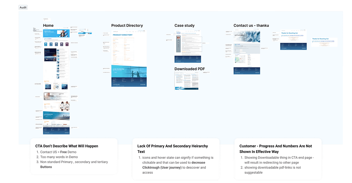

Lack of contrast and legibility in CTA (Call-to-Action), resulting in lower click-through and conversion rates.

Value proposition unclear. Users don’t have a clear idea of what to do next, resulting in High Bounce Rate and Low Conversion Rate

The absence of social proof leads to a lack of trust in the website.

The absence of proper contact and demo form flows leads to missed opportunities for engagement and lead generation.
Performance Analysis
Microsoft Clarity
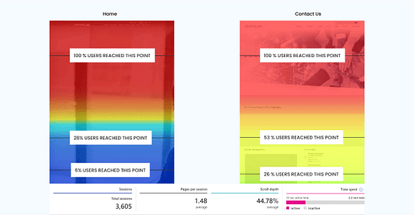
- Scroll Depth of users was only around 40% for most pages.
- Average time spent was 48 sec, but still user had no direction on the website.
- Conversion rate For Contact us page was vey low due to too much scroll depth
Google Speed Insights

- Website layout is not consistent and does not follow WCAG guidelines, hence creating accessibility issues
- Poor performance due to : load speed, large file sizes, and too much textual information.
- Conversion rate For Contact us page was vey low due to too much scroll depth
SEO Issues

- Poor keyword targeting, which reduces the search engine visibility
- Various Broken links , Crawl Errors and Slow page speed
- Inconsistent H1 and H2 And poor structure and hierarchy, resulting in lower indexing of content
Based on Expertise
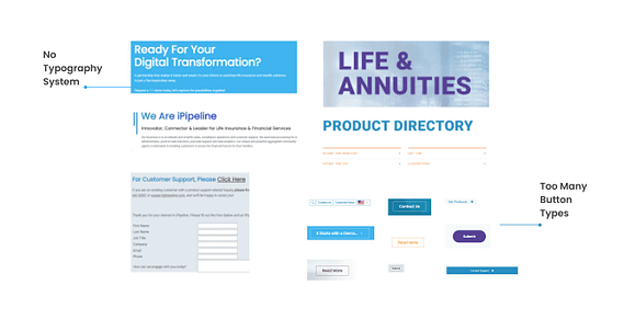
- Inconsistencies in design system increases design debt while scaling.
- Too many button styles create confusions and increase cognitive load
- Inconsistent design makes the website look unprofessional
Competitive Analysis
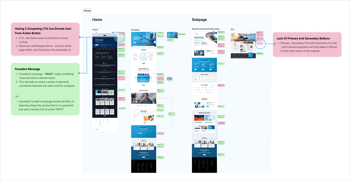
Insights from Home page Analysis

Competitors implemented a proper use of call to action.

Competitor Implemented a Better contact Us post flow.

Competitors told a Story via their page and created responsive layouts.
UX Research
Sitemap Audit
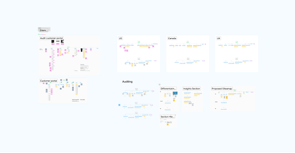
- The sitemap audit allowed us to identify and address several issues that were negatively impacting I-pipeline’s user experience.
- Conducted Sitemap Audit and Proposed Common Sitemap for Various Countries And Providing a Single for all Countries.
User Journey

- Conducting a user journey to understand pain points and issues, and the objectives of users can help businesses to create a more user-friendly website or application.
Wireframes
